Morgenmete
Brand Identity
Building out a whimsical identity for the world’s foremost magazine on breakfast
Year
2023
Services
Editorial creative direction and layout design, photo art direction, illustration direction
Introduction
Morgenmete was founded in 2018 as an independent publisher dedicated to exploring the humor and absurdity of life through the lens of breakfast. We believe in print, and in celebrating the best meal of the day, and we love that breakfast is a topic that speaks to both universal experiences and unique traditions in imaginative ways.
Although Morgenmete takes inspiration from iconic food magazines like Lucky Peach and The Gourmand, as well as industry classics like Bon Appétit and Saveur, we aim to publish stories by contributors who don’t come from traditional food-writing backgrounds. Breakfast is the starting point for our editorial, but our diverse cast of writers, illustrators, and photographers interprets that topic in endlessly creative and varied ways.
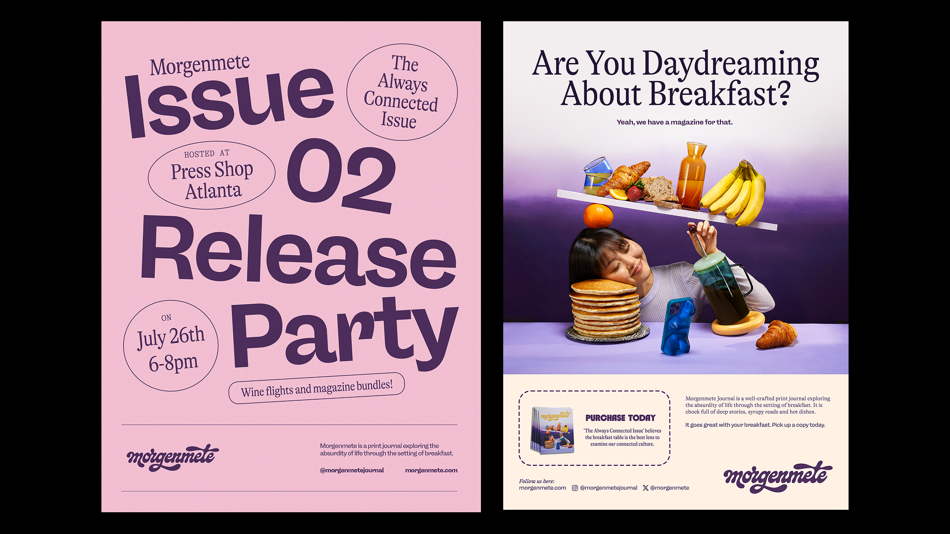
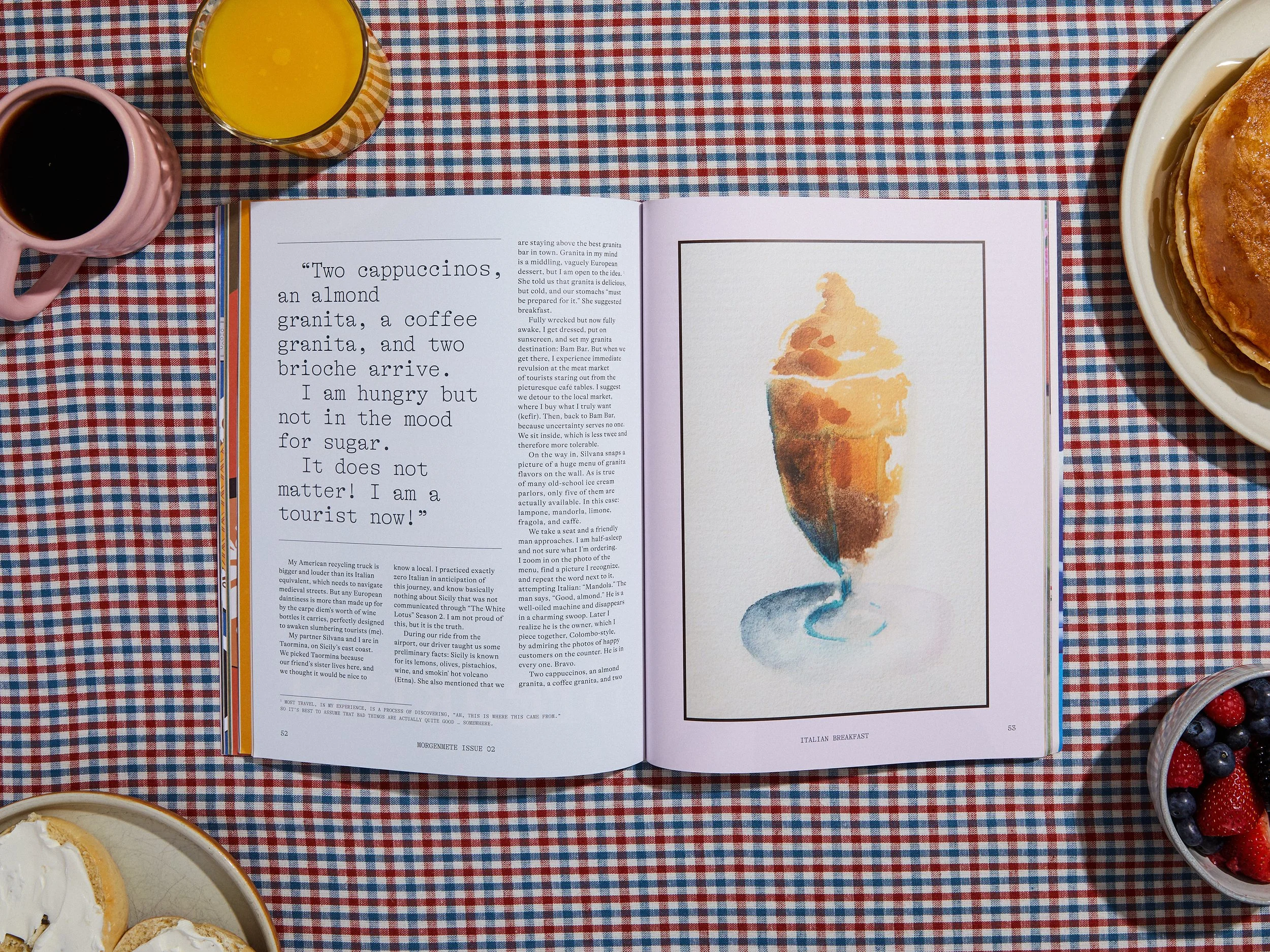
In 2019, we printed and published our first issue diving into the humorist side of breakfast with a theme around curated culture. The issue was a hit on Kickstarter and found it’s way into many independent shops across the world. With Issue 02’s development, I set out to build a cohesive, upbeat and irreverent branding for the magazine going forward. Below, you can see snippets of the branding from Issue 01 which had a wider array of type work, colors and less cohesive layouts.

The people who read our journal include those in the food industry; chefs, recipe makers, influencers. We also court a lot of food curious and fans of visual storytelling; those in the creative writing and design industry, writers and food enthusiasts. Our print magazine stands out on shelves and attracts those who are interested in artfully designed print products they showcase in their spaces.
The Wordmark
My biggest goal for the branding for Morgenmete was to have a stand-out wordmark in the vein of old-school magazine wordmarks. There was a lot to explore when it came to this, so I worked with Tina Smith to develop a custom wordmark. I knew I wanted an impactful, bold masthead. My initial pitch was for a logo that felt syrupy, a little goopy, trendy but timeless, and the process of developing that with Tina was so much fun.
“I wanted the logo lettering to feel goopy and liquid, like it could have been poured from a syrup bottle.” - Tina Smith
The Moodboard
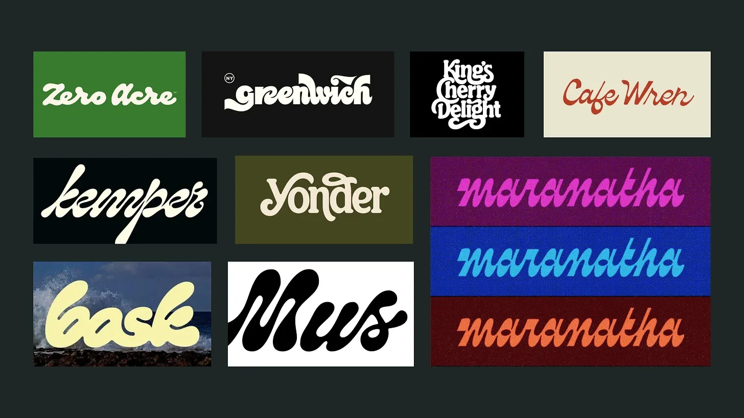
I really like goopy scripts, wonky letter forms, and connected letters. Tina had recently done work along those lines for cooking oil brand Zero Acre, and I felt certain that she’d have a good eye for this project.
”I have a soft spot for goopy script lettering and was so excited to see a whole direction with that reference. It was a big range of reference so I knew it was pretty open. Usually I take in reference and then draw without it in front of me so I'm creating something unique on my own.” - Tina
First Rounds
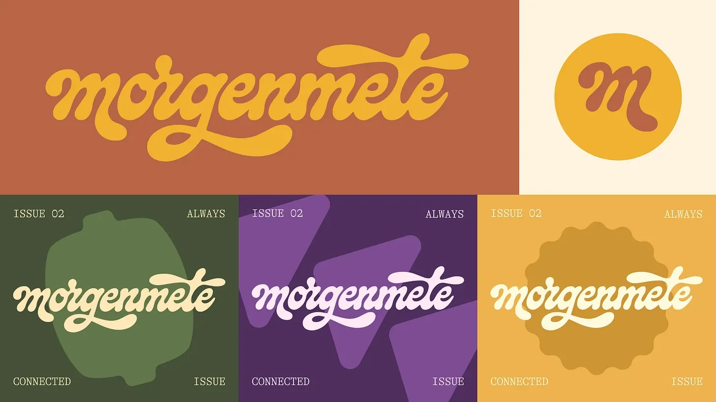
The logo was broken down into three different creative ideas: syrup label, cookbook cover, and snack brand. You can see the syrupy text idea in the first four options, followed by four that bring a ’70s cookbook vibe, and four more far-out fonts that would be at home on snack packaging. Syrupy text felt like the best option for this project, and so Tina continued to perfect these letterforms, along with a logomark “M.”

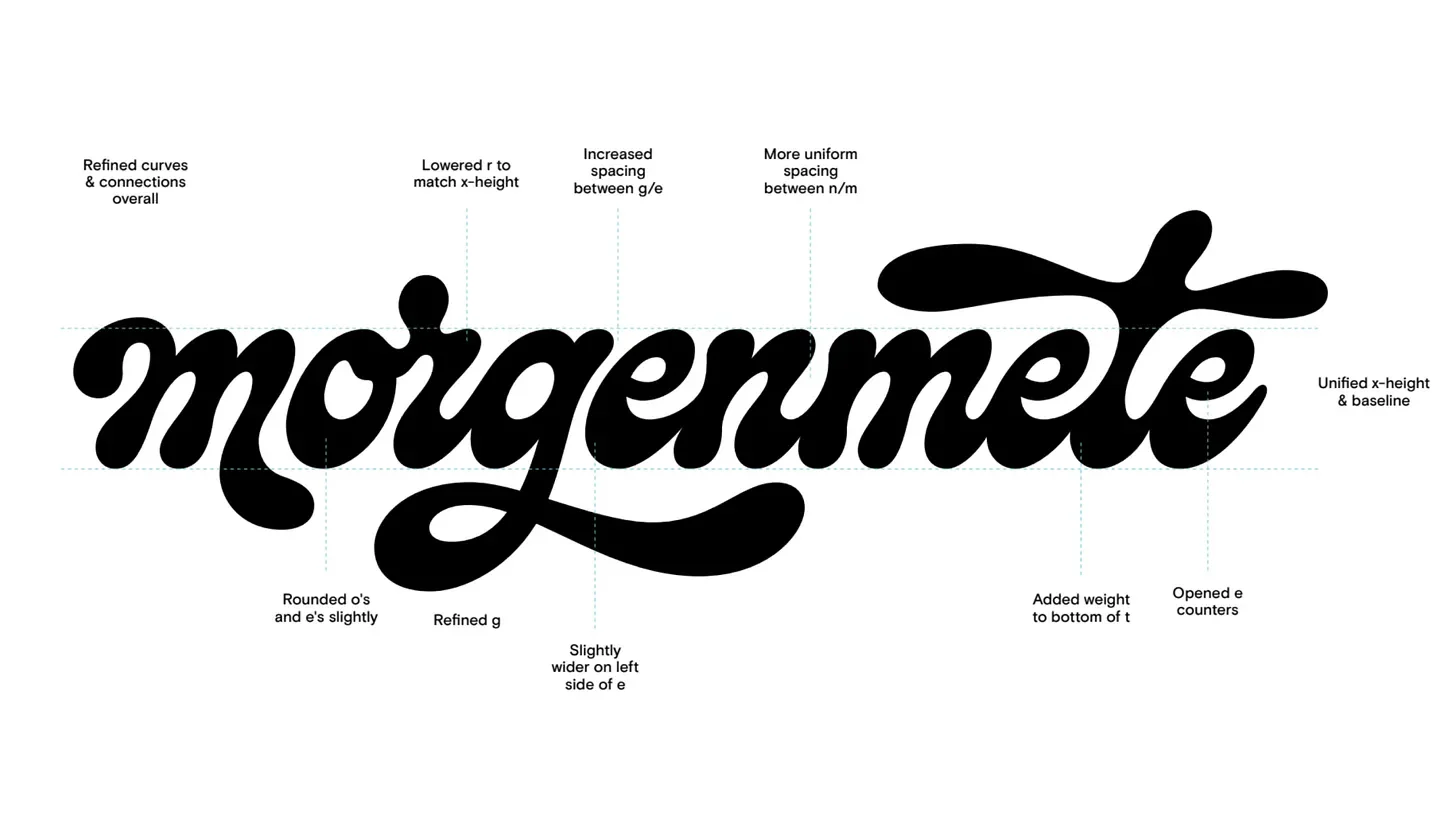
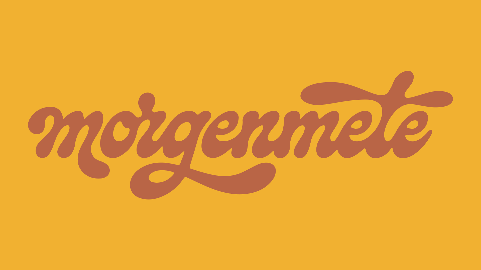
The Final Logo
Here’s the final wordmark, and the one you’ll see gracing Morgenmete’s covers going forward. I’m really proud of it, and how it represents the spirit of the magazine.
Web Design
We needed a storefront update for Morgemnete that served as a home for content and the place to shop for issues and merch. I moved platforms to Webflow for flexibility. I designed out all the pages for desktop and webflow, working on leading with a big wordmark on load that would minimize for the navigation. I wanted it to have the same styles and layout principles as the print issues, for brand consistency.
Layout and typography
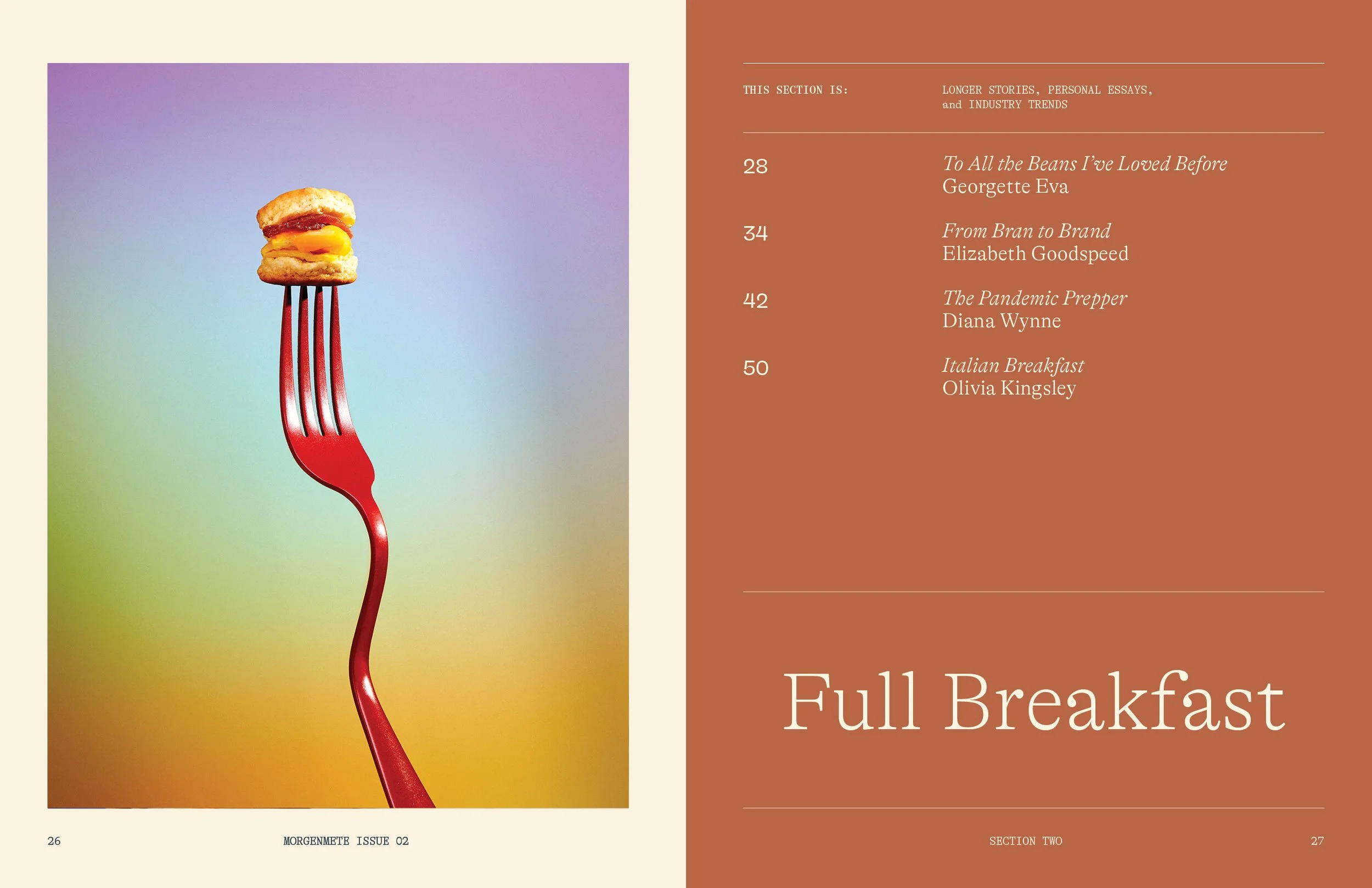
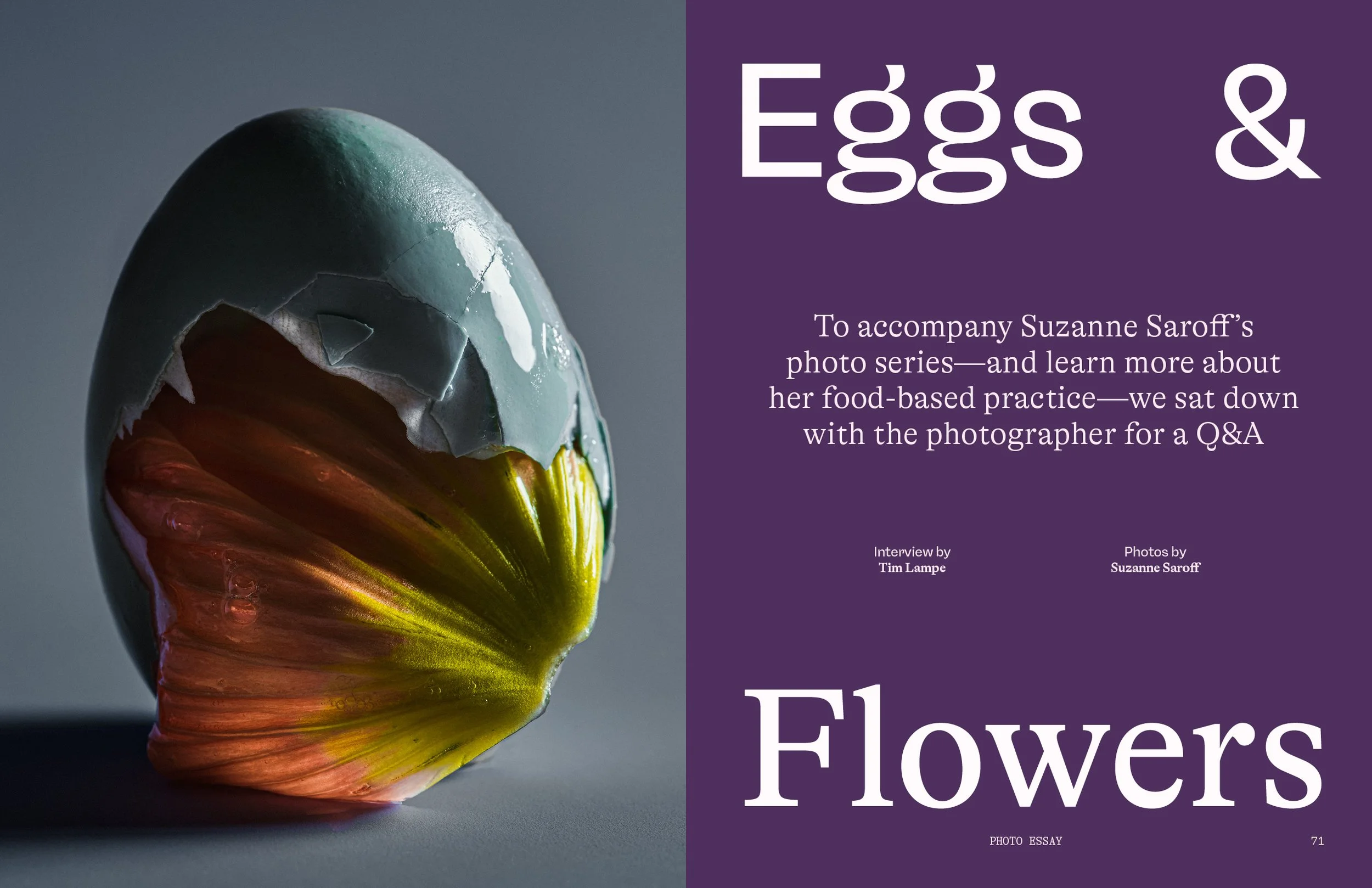
For the overall branding, I wanted to balance sincerity with playfulness. In order to do so, I used GT Alpina as a sincere serif type paired with the more playful sans RB Freigeist. That become the foundation of the identity, along with a set of vibrant and retro feeling colors.