Zendesk Global Brand Refresh
Award-winning brand refresh for a global iconic brand of customer service software
Services
Art direction, layout direction, photo direction, brand identity, brand systems type and color development
Year
2022-2023
Introduction
How do you refresh a global enterprise brand as big as Zendesk? The new brand expression required distinction—the ability to stand out within a crowded market and define the very category of what CX should look like. The next quality we sought after was a certain level of timelessness. While the new brand look and feel needed updates to be brought into the current sphere, we also needed to build a design system that would be long-lasting and flexible enough to endure continual change.
We also considered practicality and equity—while we as a creative team are passionate about making beautiful things, beauty has little purpose in a brand system if it can’t easily be executed or extended upon, or if the end results aren’t accessible to all users and members of the Zendesk audience.
VP of Creative: Erin Pinkley
ECDs: Betsy (Filson) Field, Olivia Kingsley
ACD: Tim Lampe
Sr Designers: Faustine Gheno, Rachel Frankel, Clark Hubert Guy
Illustration Lead: Olenka Malarecka
Photo Lead: Marta Dymek
Principal Copywriter: Diana Wynne
Sr Copywriters: Raven Wright, Julia Oller, Kendrick Hammond
Brand Systems: Cristina Mendoza Magari, Arienne Gagui
Producers: Caty Chung, Renae Vespremi, Kevin Tsukii, Anna Cirera, MacKenzie Covington, Jordyn Fields, Beryl Baker
Digital: Kristina Alford, Adam Chung, Silvana Yaneva
Motion/Video: Mary Vertulfo, Victor Hugo Duran, Colin Thomas, Tori Cincotta, Monica Yap, Sara Farnsworth
Iconography: Laura Bohill
“In 2022, Zendesk entered a period of stagnation, flatlined growth, and increased competitive pressure. As the industry leader and innovator in customer experience, Zendesk was due to pivot and create a refreshed standard. Over 18 months, the in-house creative team developed a new look and feel, which launched in May 2023, at Relate, the company’s flagship user conference.”
The Brief
The Problem: At 15 years in, Zendesk was fighting for distinction in a sea of competitors within the CX space. Various companies had "adopted" several aspects of our unique brand language, which diluted its impact over time. Transformational change within the company and the broader CX industry signaled it was long time to refresh our brand positioning, messaging and visual look and feel. In order to effectively reach our audience and grow the business, a new mature and confident brand expression would decisively increase our brand distinction and demonstrate market leadership.
Goals:
Shift perception of Zendesk from SMB-focused to a mature and frictionless enterprise-friendly solution
Develop an ownable, distinct visual expression and voice that positions Zendesk as a leader in the CX space
Steward the brand for a larger market presence and increased engagement
Signal maturity, sophistication, quality and relevance
Create a scalable and accessible design system
Deliverables: Art direction, branded imagery, tone of voice, website, systematized asset templates, motion & animation, sonic branding, brand guidelines
Awards:
World Brand Design Society
Identity: Brand Redesign - SILVER
Illustration: Identity - SILVER
Typography: Graphic Design - COMMENDED
Registration of Graphic Designers
Integrated Awards: Branding Identity - Rebrand/Refresh
Brand Identity
The process started brand team workshops, which were envisioned by me and moderated by each of the functional leaders. I lead type, color, layout, brand expression and photography workshops. What resulted was clear concise takeaways about what to keep, leave behind and what requirements were needed for each function heading into a refresh. Around the same time, a separate group of folks were updating our brand positioning and framework, so we were taking this back into our work as a north-star in the creative brief.
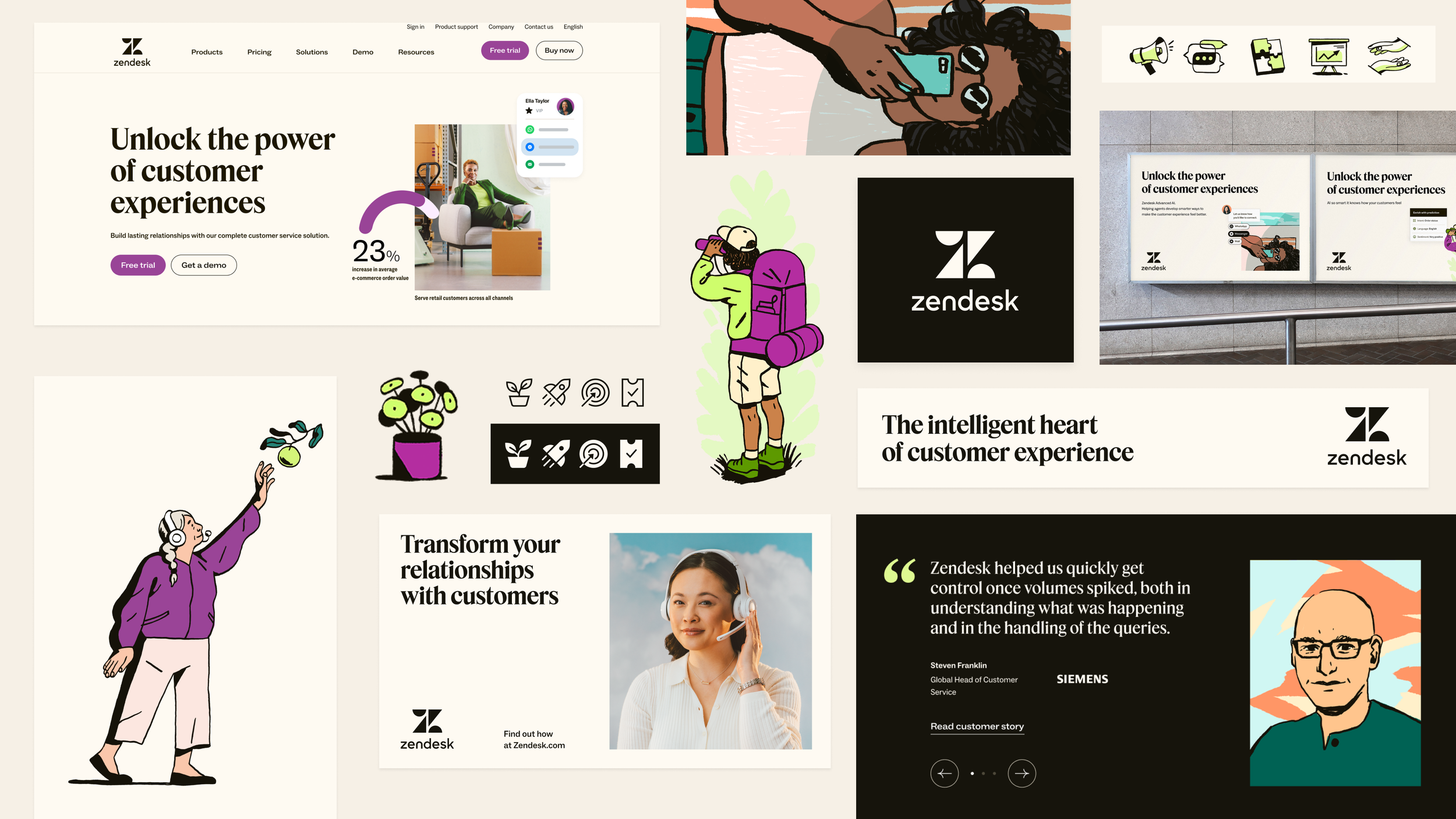
Our small brand identity pod worked on a few creative directions in the form of brand statements, mood boards and rough motion visuals. Ultimately we presented two directions to leadership. We moved on to in-person workshops where we iterated on hundreds of of visuals and ideas, collaborating with our copy team on positioning statements and small concepts. It was a few days of working in small pods, developing slightly different graphic and strategy approaches. This was a fun collaboration that included motion designers, digital designers, copy and strategy folks.
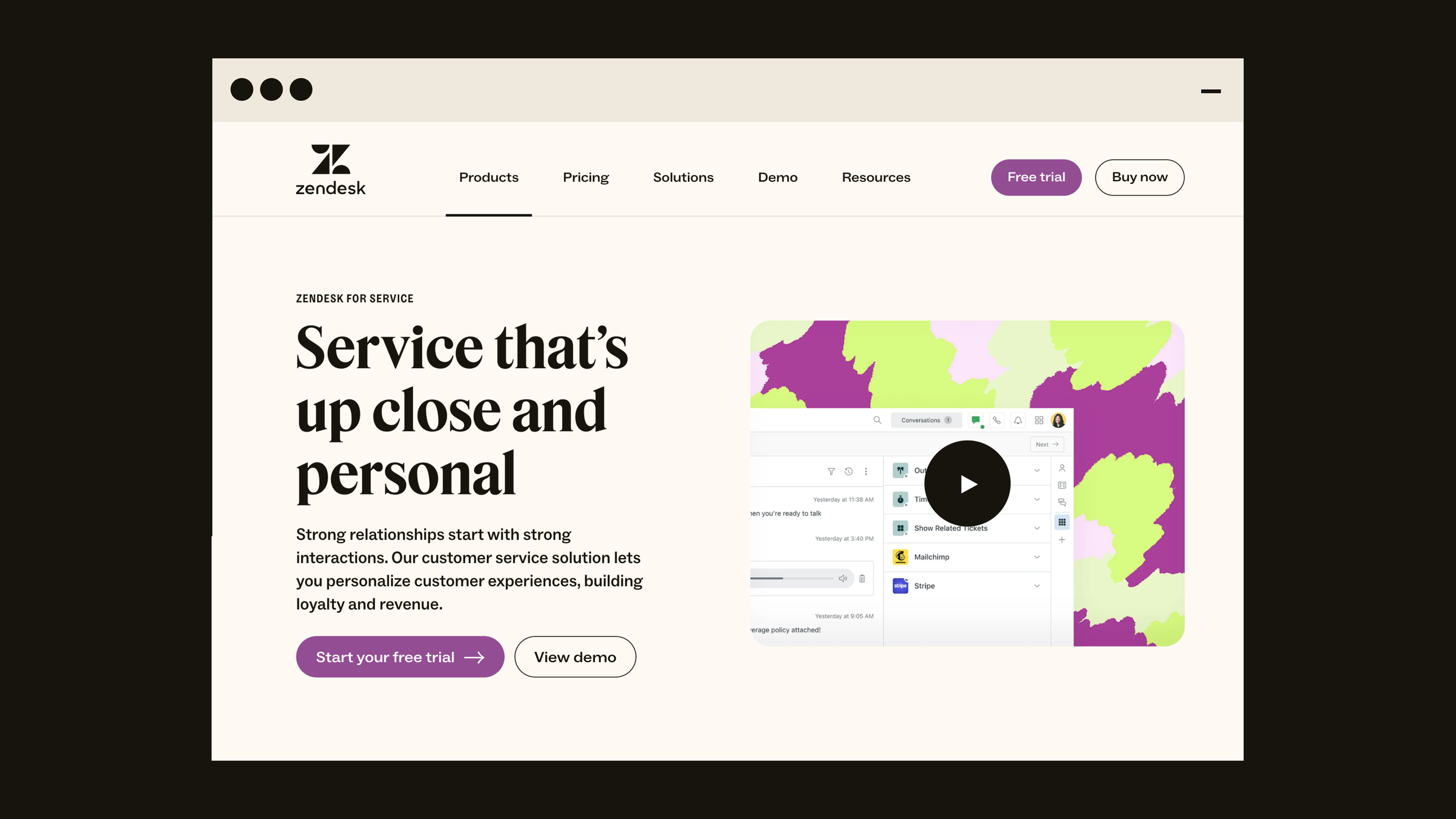
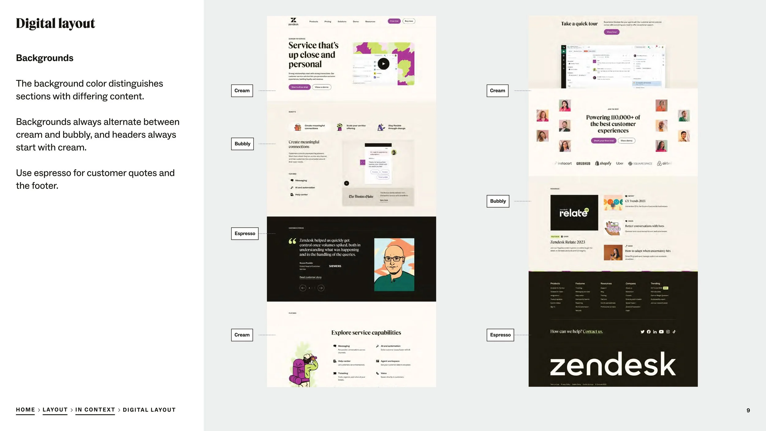
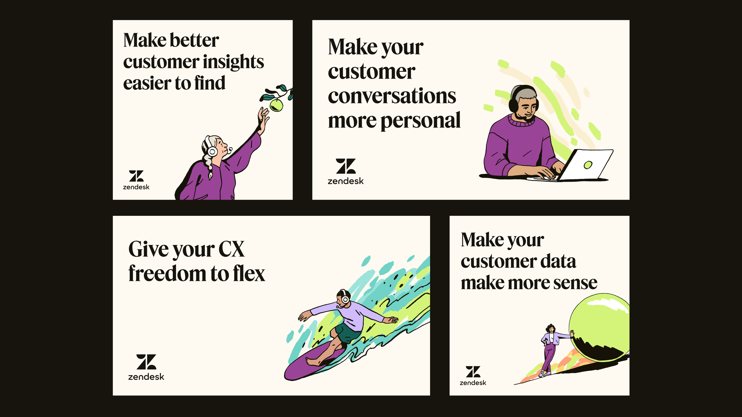
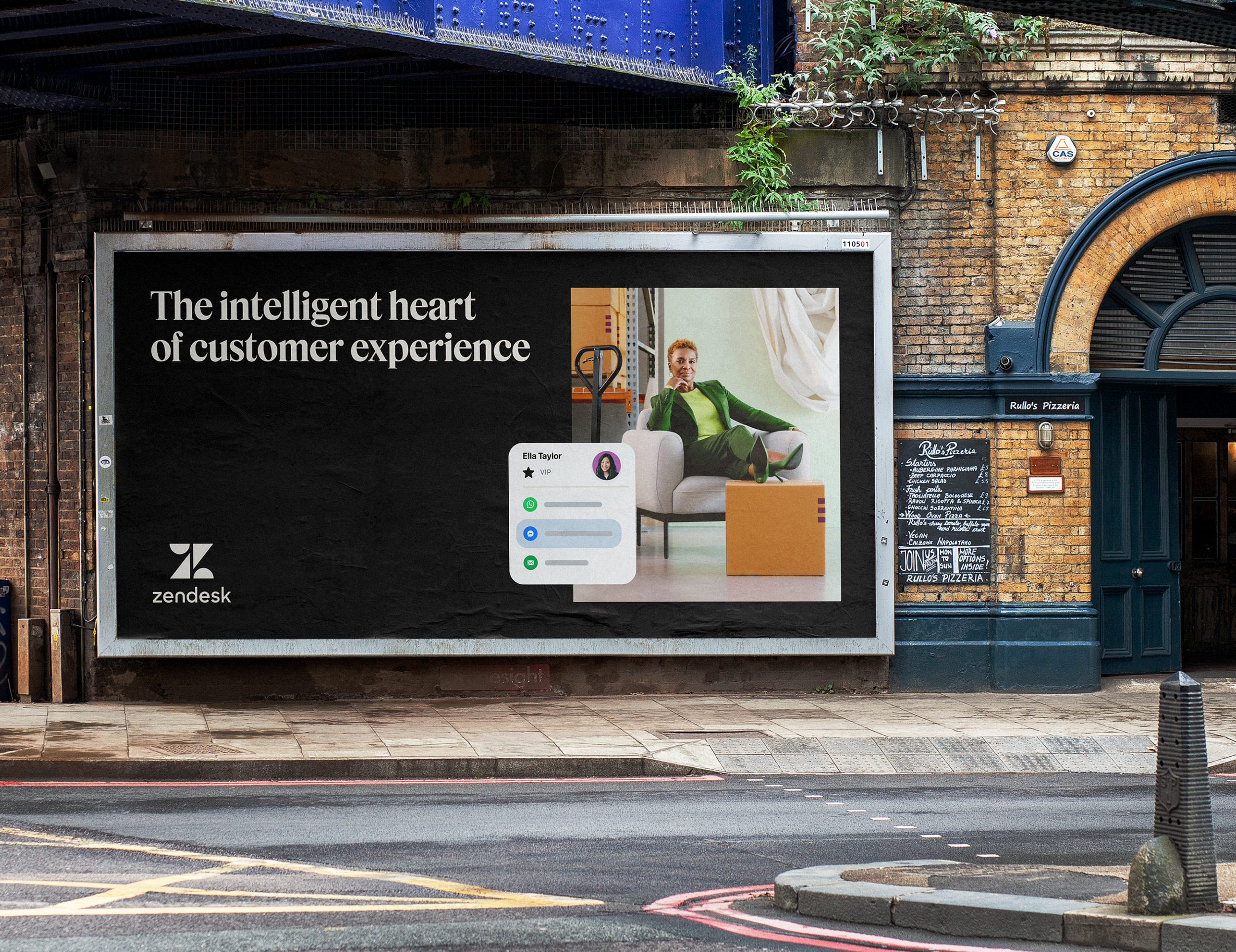
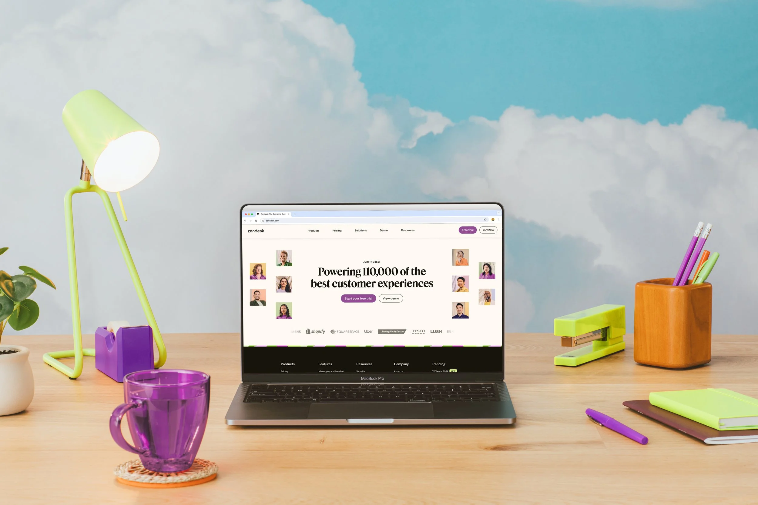
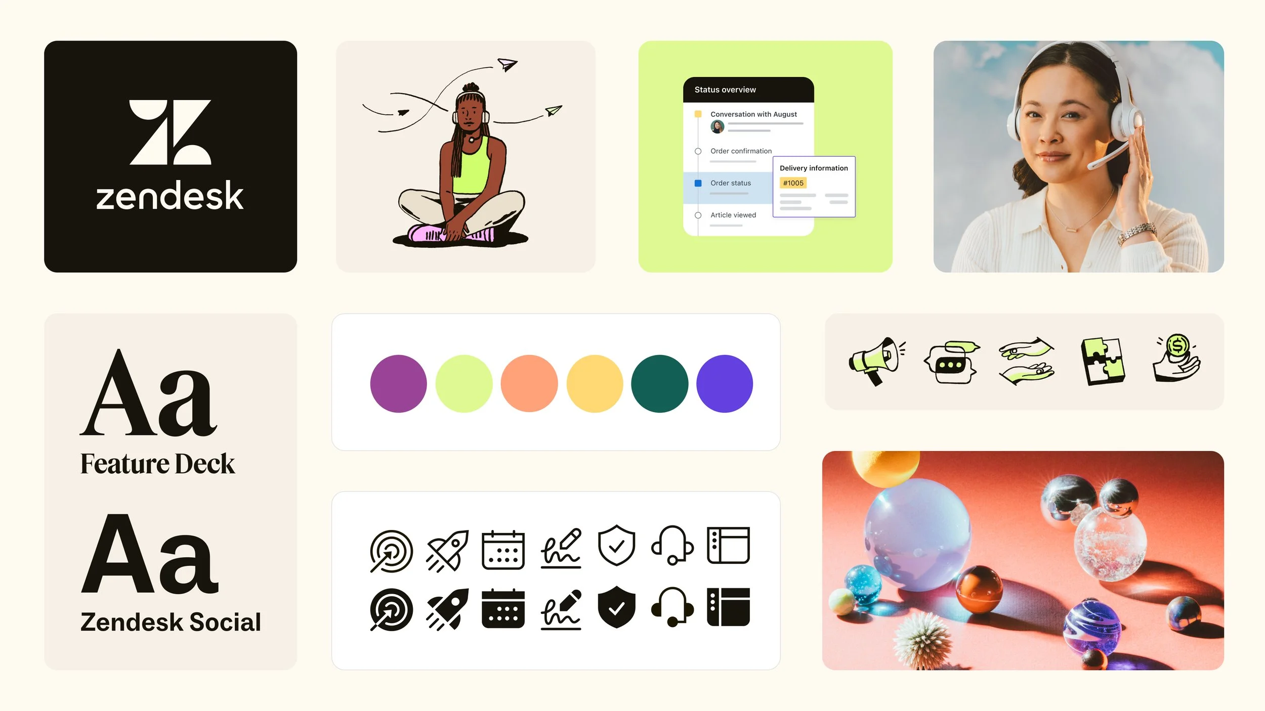
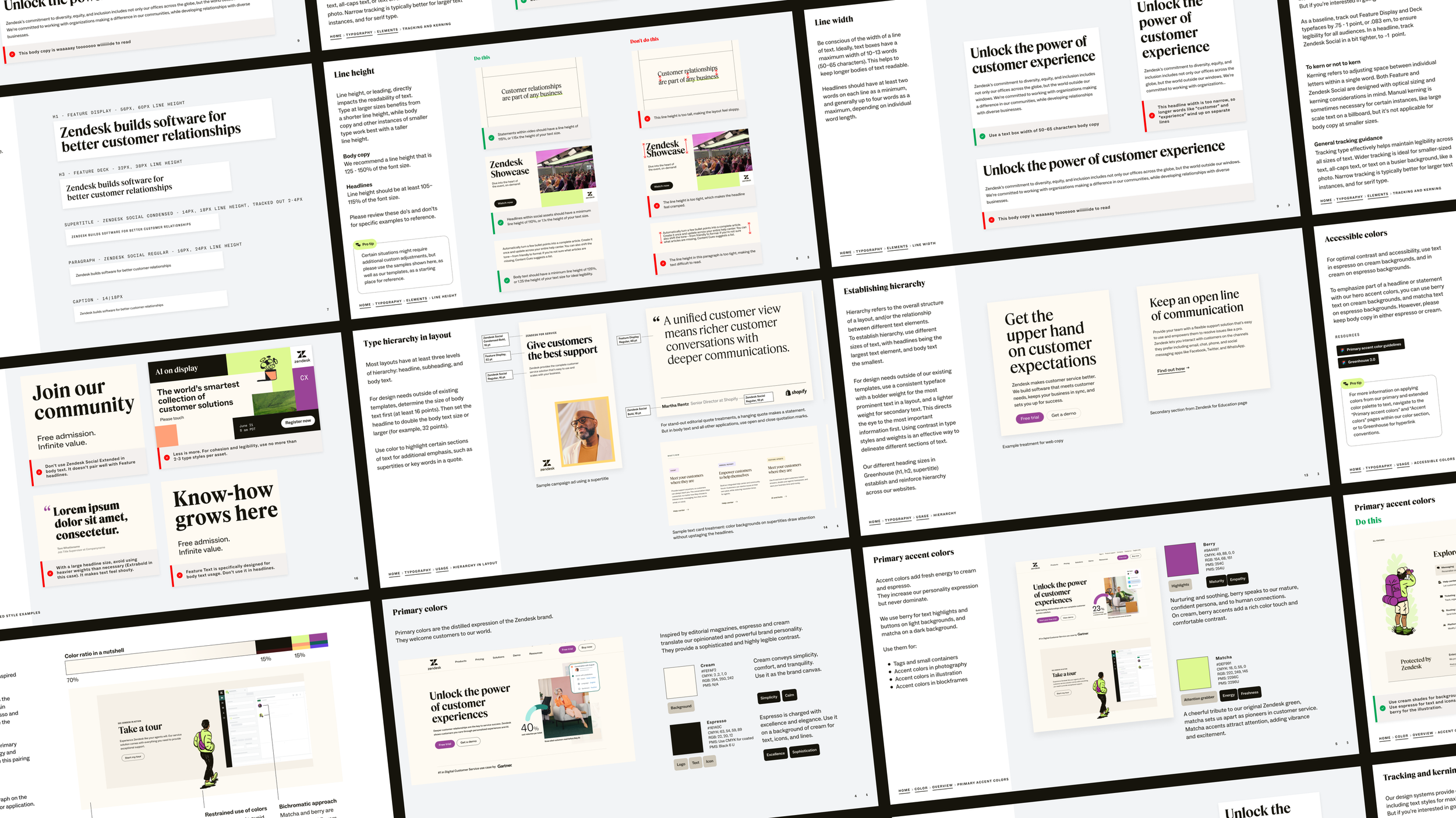
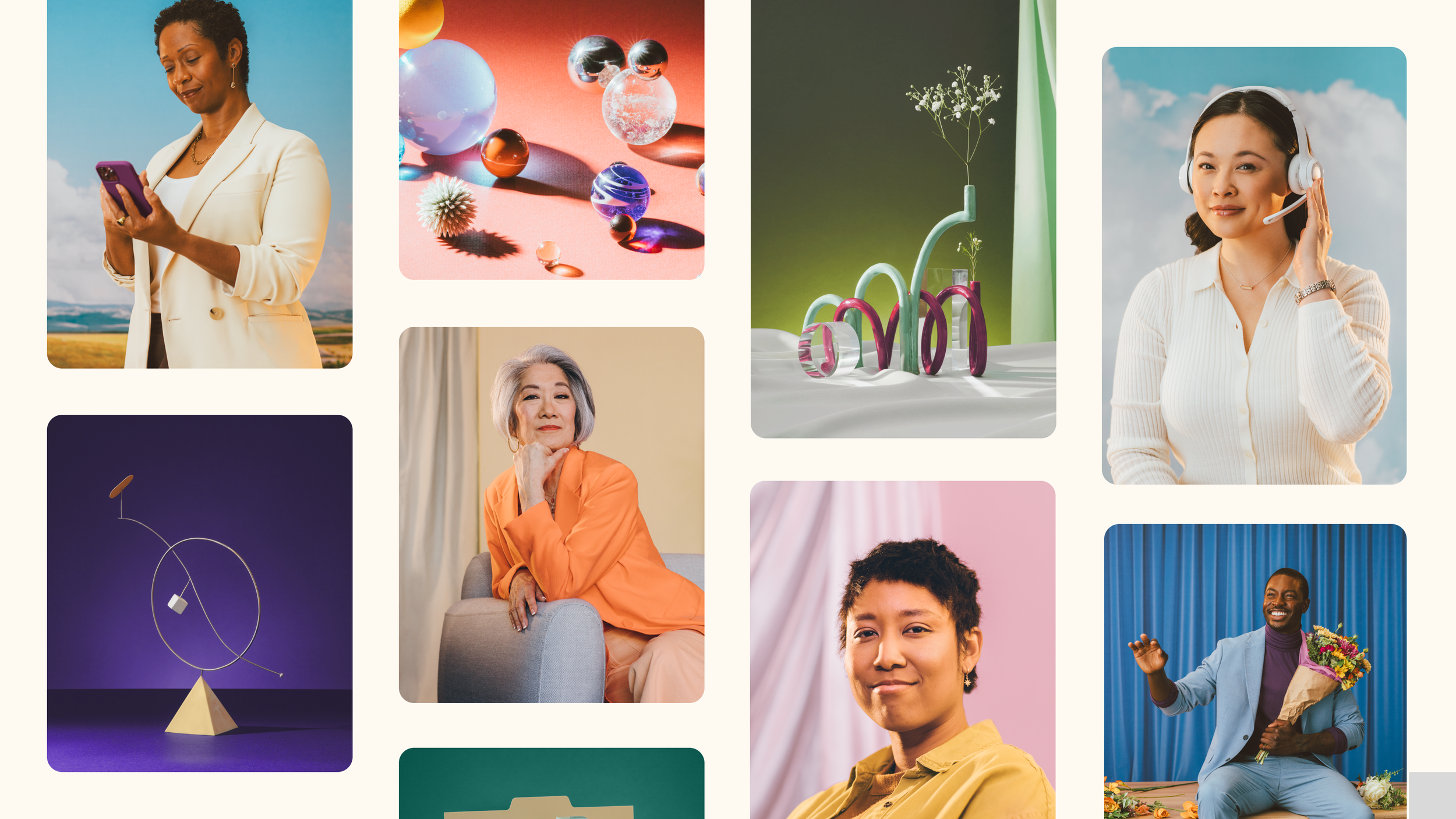
The work came back to our identity pod to develop color, type, layout and expression. For color, we developed two concepts of color leading with confidence versus generosity. Where we landed, surprisingly, was being bold and iconic, and that meant a strong brown-black and cream base. It signaled iconic in the way our marketing leaders were really looking for. Coffee and cream became the main brand expression. For accents that represented energy and empathy, we were able to bring in a berry and a matcha color.
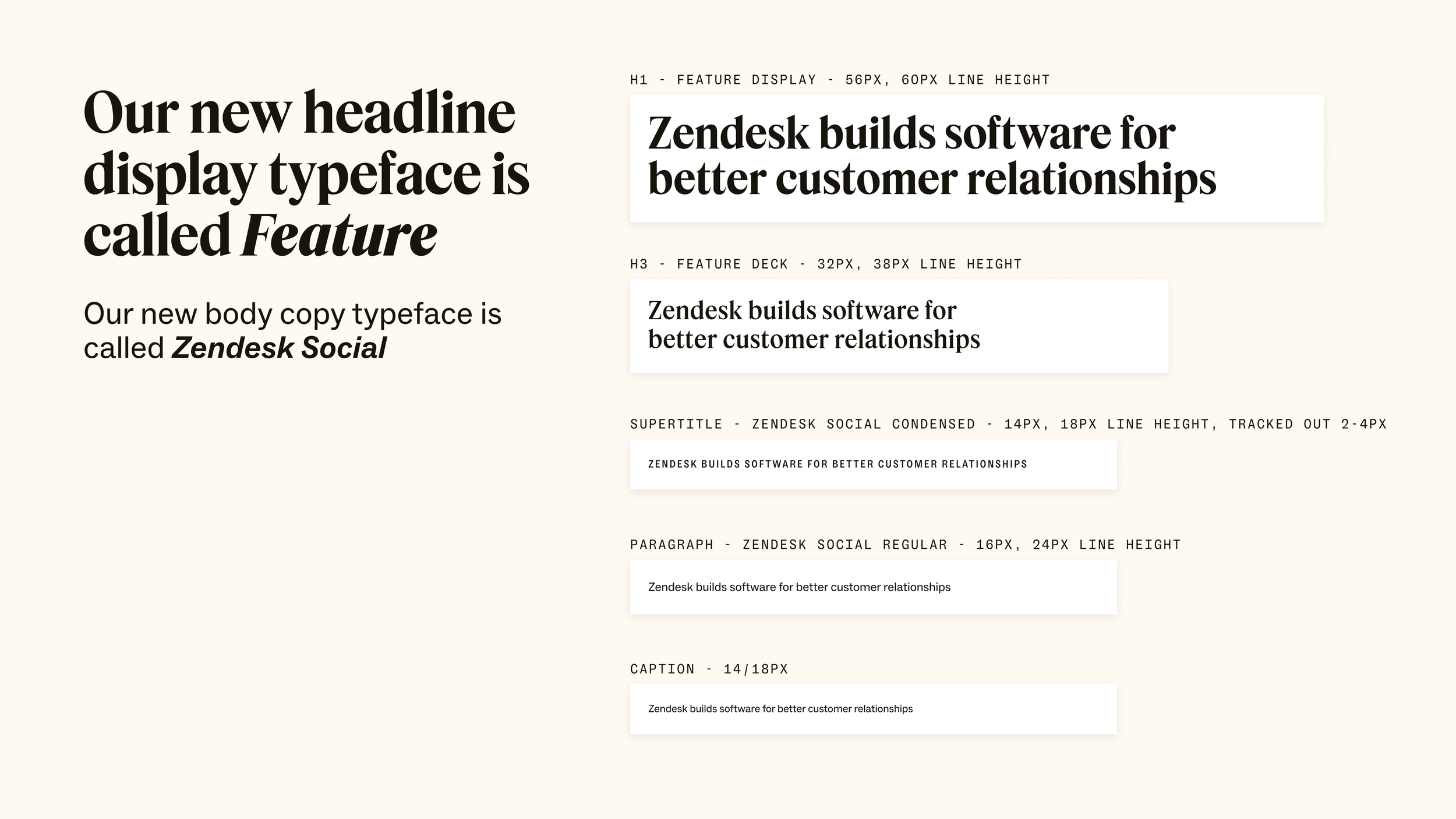
For type, we really wanted to explore a serif along with a sans for accessibility. Taking nods towards editorial inspiration, a lot of these elements were then explored inside of layouts to see if they felt right. We were pushing for that nice balance of sans and serif in our test typefaces.
For a few months in the process we had built a prototype of the brand identity guidelines in Figma. We built an MVP of the refresh and our idea was to hand this off to other functional teams: motion, video, events and campaigns, and see how they evolved it. They brought their own requirements, challenges and inspirations back to us. It was an incredible process to build and MVP, and iterate on this as we applied it to real world usage. This also helped inform the systems we would build for our internal teams outside of creative.
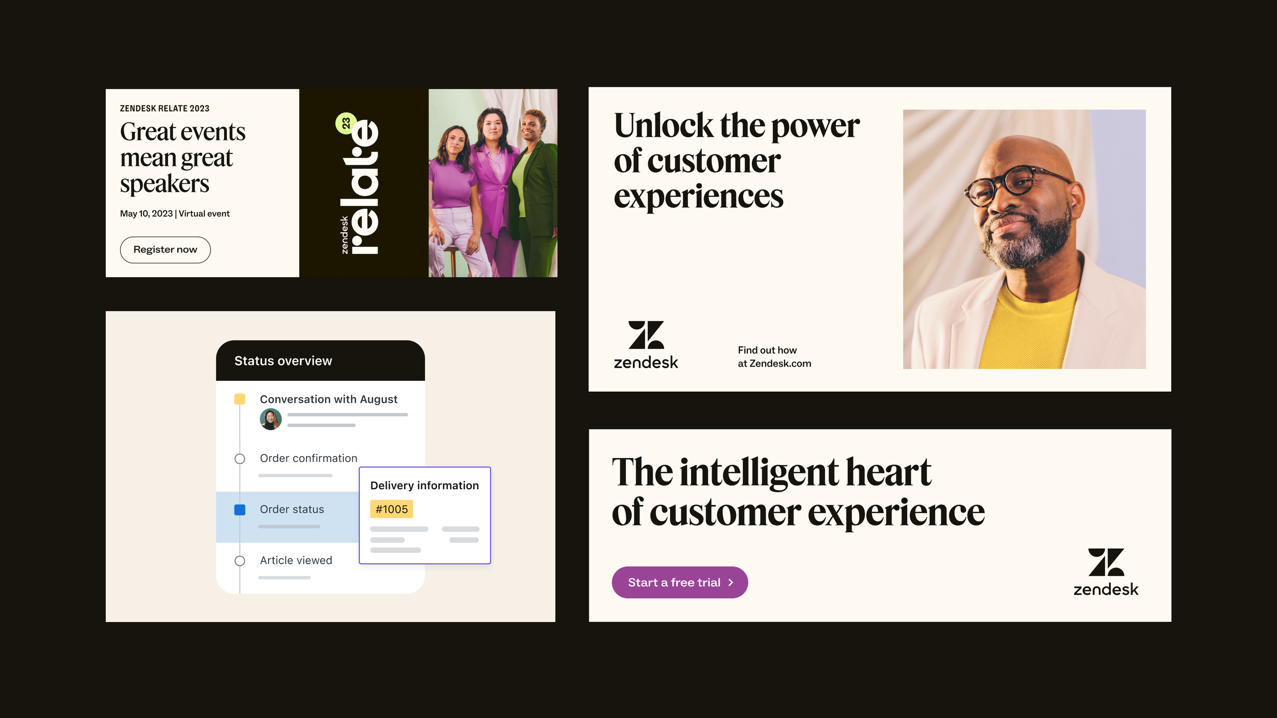
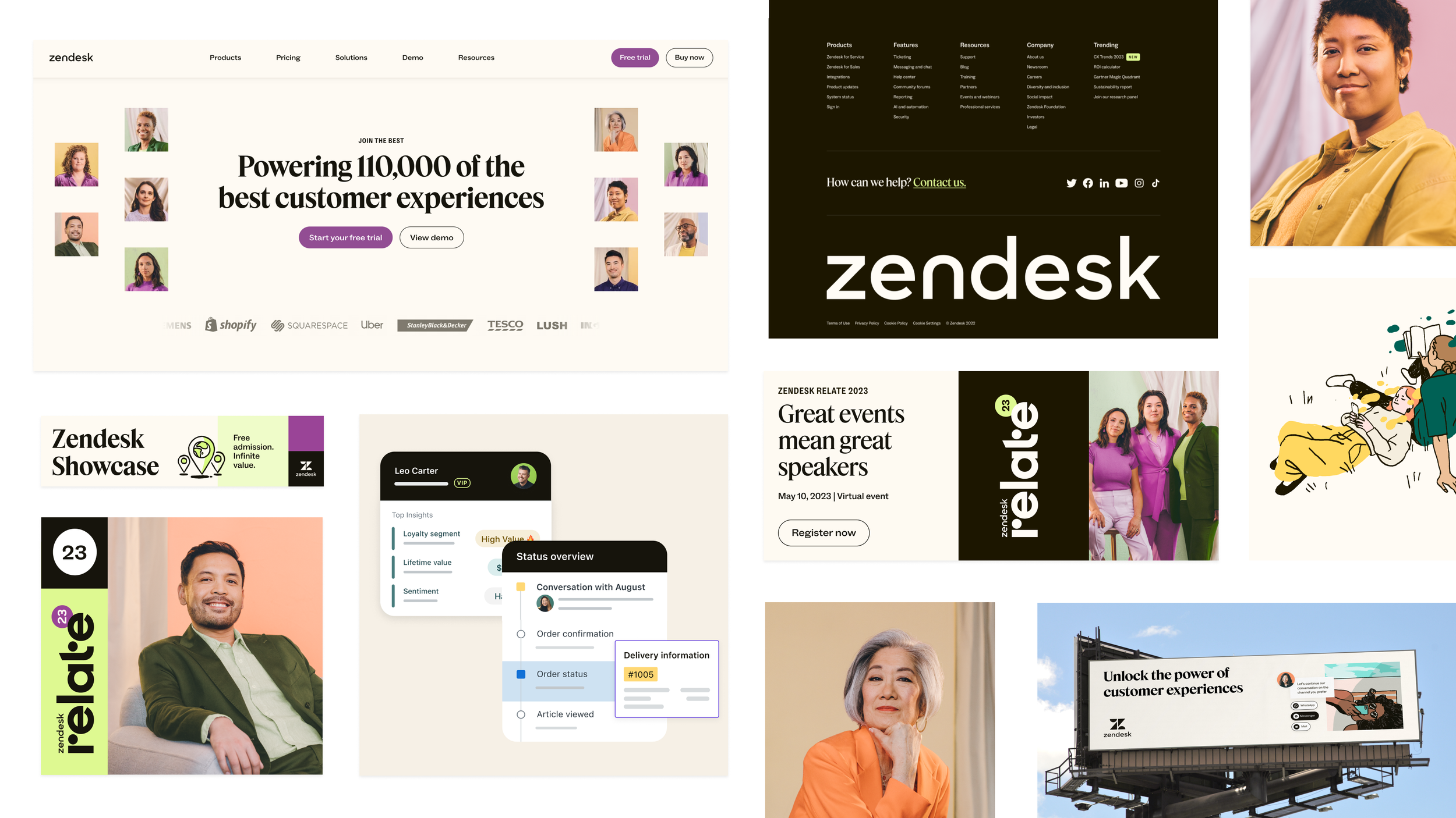
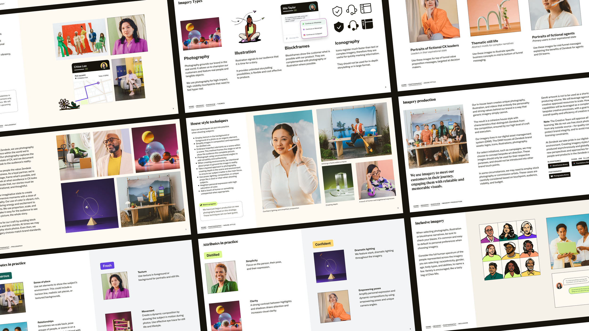
Building out hero moments